Useful as it was, I was never a huge fan of the previous Streamr app, one of the oldest parts of Streamr’s tech stack. From a user perspective, it lacked a central point, and had a lot of fussy, small views hiding much of the functionality behind modal dialogues. Once we launched the Marketplace in May 2018, the disconnect between old and new became very sharp.
Then, of course, there was the front end code. The ageing codebase that the Editor was built on made it increasingly difficult to fix or improve, especially because code for its functionality was mixed in with code for the user interface.
In short, what we had needed to be modernised. And that’s what we’ve tried to do. When we began, these were our initial aims:
- Create a single point where we could let users manage their streams, canvases, dashboards, products — and in future, control a Network node, and view income from Marketplace products and Network nodes.
- Add a blockchain transaction history view.
- Rewrite the front end of the Editor app in React — a Javascript framework, developed originally by Facebook, that is based around modular code blocks.
- Improve the usability of the entire app.
For the rewrite of the Editor front end, we were initially considering re-implementing the old UI wholesale — quirks and all. It would have saved development time, but we soon recognised that doing extensive back end work only to end up with an app that looked and worked much the same from the user’s point of view, would have led to a collective meh from the Streamr community come release day. That’s why we also decided to rework the UI and UX, as well as the code.
So what’s changed?
Table of Contents
Core
One obvious thing is the name. After we’d implemented all new views to tie the Editor to the Marketplace and all other user files, it became clear we had ended up with something more than what we’d initially planned, and it deserved a better name than just “the user pages”. It is the central point for users of the app, and so Core just seemed right.
These views are a big part of the update, and bring streams, canvases, dashboards, Marketplace products and purchases into a central location where users will land when signing into Streamr.
New views here include canvas tiles, live search and sort for each view, a notification system, a blockchain transaction history, an updated Profile section, and a simple onboarding help system tucked behind the ‘?’ icon.
Future iterations will include features for viewing and controlling performance of Network broker nodes, as well as checking your wallet balance for Marketplace or Network revenue.
Ethereum Identities
We’ve added basic Ethereum identity support to Core, so you can create an account and log in with just an Ethereum address, and we’ll be building on this with future updates.
This update moves the module help out of intrusive modal dialogues and gives them room to breathe in a popover sidebar. We’ve also added a new system for displaying all the app’s keyboard shortcuts to help new users get up to speed. For bug reporting, this is where you can also find the current Core app version number.
Autosave
All modern web apps do this, but the old app didn’t, so users had to manually save their files or fear losing their work. We’ve followed Dropbox Paper’s fairly simple and user-friendly system of quietly letting users know when their file was updated.
Undo + Redo
Again, this is now a standard feature of all modern apps. However, with a web-based real-time data application, we faced some particular complications in implementing such a feature. There is still some work to do on this to make it truly work in the way we want, but we have created an MVP of the feature for this beta release.
Smart Cabling
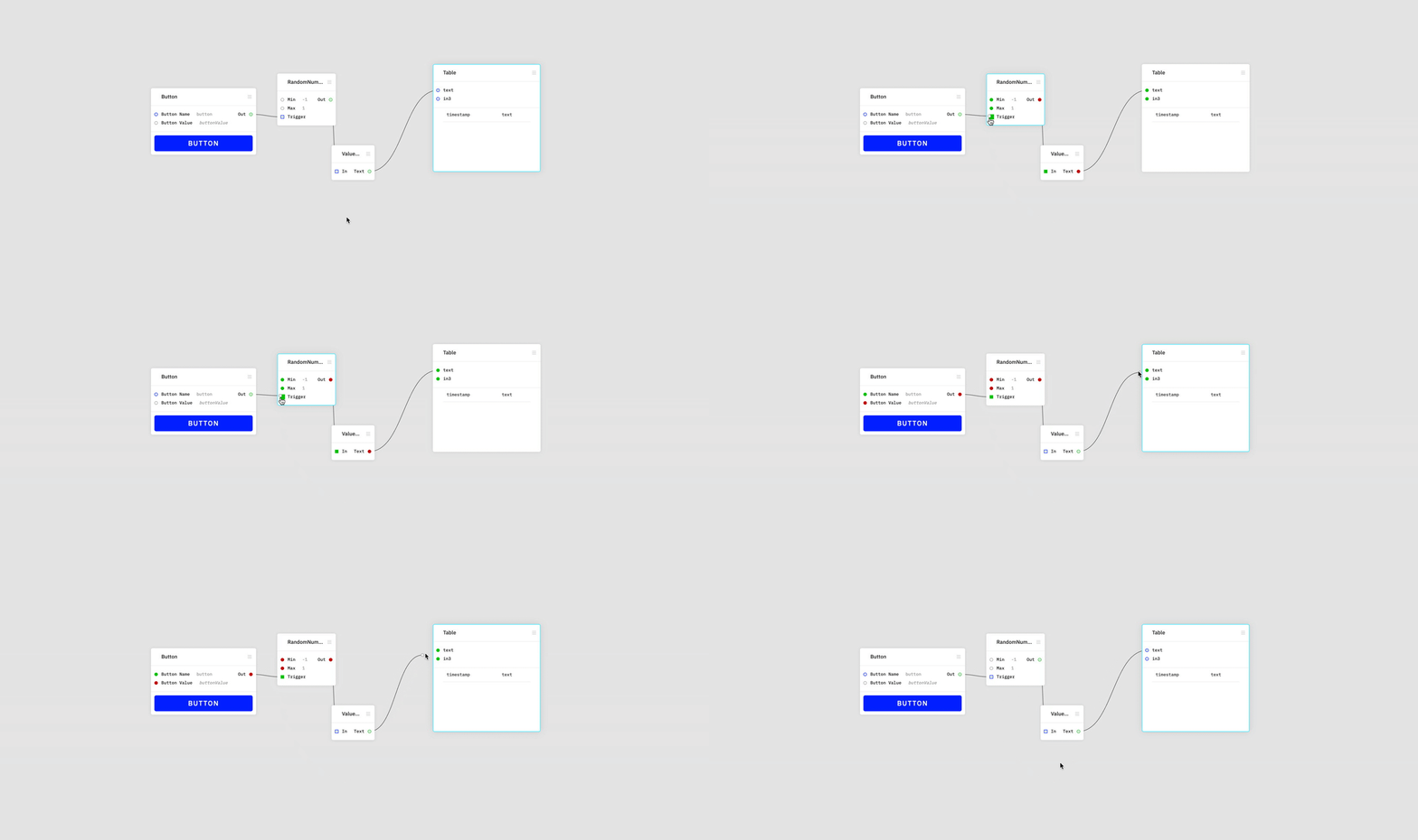
One of the intimidating — or perhaps frustrating— features of all node editors is working out which inputs you can actually connect an output to. The old app had a version of this but now in Core it’s been cleaned up. Ports that are connectable turn green. Ports that aren’t, show as red. We hope that’s of great help to new users.
Module Panel
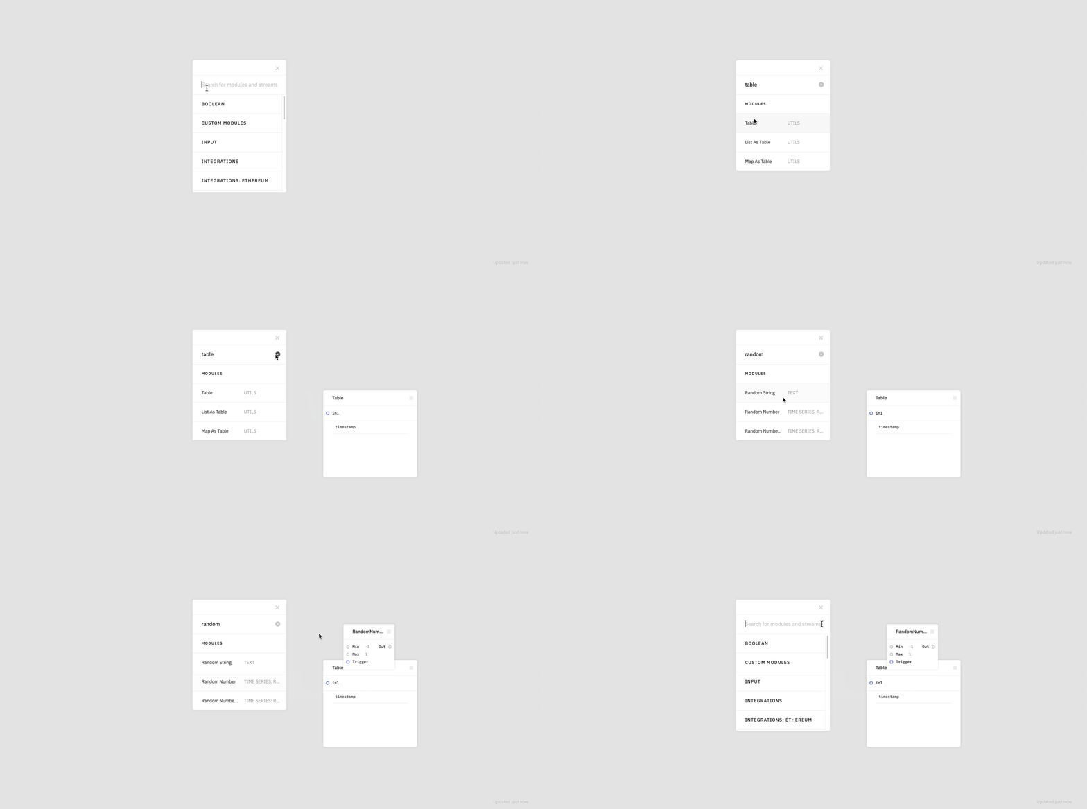
The functionality here is basically the same, but we have expanded how it can be used. Users can put the panel wherever they want, expand the browse view if they have a big screen and can fit more on there. They can either drag and drop, select and click, or select and hit return to create a module, which will be created beside the panel. They can also choose from search results with arrow keys.
We have also removed the multi-level menu in favour of a simple two-level, category with contents layout.
Clearer Canvas UI
The new layout makes the module UI cleaner and simpler. We rearranged the runtime controls in order to make it clear at a glance whether canvases are running or stopped.
Finally, we have also reworked the layout and clarity of all the Streamr documentation. The contents still need some updating though, because docs are always the last thing to get done, but we’ll be updating them over the next week or so.
Overall, there’s a lot of work that has gone into this release, but it is still in beta, so you will find a few things still rough around the edges. We see this release as a good baseline to build on—all the Streamr apps have now been redesigned and re-engineered to work together, and from here we will focus on specific use case tailoring and improvements. If there are features, integrations or improvements you’d like to see, please let me know.
There’s also a link in the onboarding help menu to report bugs, so if you find any, please do so.
But more than anything else, just try it out — and thanks for reading.
Log in to Streamr Core here.
You can catch Matt on the official Telegram channel almost any day (He’s on Oz time) or you can reach him directly via email: matt at streamr.com.


