It has been a while since I’ve written about Streamr design, so I thought I’d share a preview of what the design team will be rolling out to production early next year. To understand what we’ve been doing, it helps to have a bit of background on the various pieces of the Streamr platform.
The first big chunk of design work was the new brand we completed earlier in the year, which laid the groundwork for all the apps to build on. From there we worked to some pretty tight deadlines on the new Marketplace app, which went from our first Sketch files in mid-February to a soft launch at Consensus in May. With the Marketplace, we introduced some basic file management tools, in the form of the Products and Purchases views, where you could view, edit, and delete your files via a tile UI.
From there, the problem we ran into was that we had multiple sets of files being produced by the various apps in different places: real-time data streams created by the dedicated tool (tucked in beside the Editor), canvases and dashboards produced by the Editor, and products created in the Marketplace. That was quite a bit of chaos, with inconsistent branding and user experience meaning that it really felt like a bunch of random apps, rather than an integrated platform.
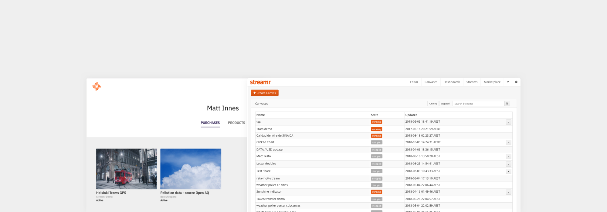
Since launching the Marketplace, we have been focused on creating a convenient central location to join the dots of the platform; streams, products, purchases, canvases, dashboards, and a blockchain transaction history, something which has been missing entirely. Enter the new unified User Page view.
Aside from unifying a fractured user experience, a single destination point for anyone signing into the platform means users are no longer pushed either to the Marketplace or the Editor. We can help onboard them from a convenient central location. The design team has also revamped the user settings and stream creation tool, making them just one click away from the user pages. These user pages are private for now but are designed in such a way that public, customisable versions—which could also be thought of as branded vendor stores—will be entirely doable in future.
The next item we have been working on is the Streamr Editor, which was long overdue some love and attention. Tim Oxley has been leading the rebuild of its creaky front end architecture with a brand new component-based React UI. At the same time we have given it a design pass to improve its usability — not a complete product redesign. Having redesigned Finnish startup Vizor’s Patches WebVR node editor a couple of years back, I had a fair idea of where the pain points would be.
Just cleaning up the user interface was a major consideration. Node editors are notorious for their insanely complicated screens populated by hundreds of nodes. Streamr was no exception: lots of cruft and no consistent grid. The goal was to create something simple and clean so even the most complex user canvas would always remain readable.
We started with the basic atoms of the user interface — the modules. Our earlier rebrand had given us a great monospaced font, Plex Mono, so we could bring consistent lengths to the parameter names. As with the other Streamr apps, we’re using the 8pt Grid System. So we have redesigned the ports to fit that and built up the module interface as simply as possible on the grid from those elements. We have also simplified the parameter value display to dispense with controls until the user clicks on a value, at which point the relevant controls (dropdown, input field, toggle switch, etc) are shown.
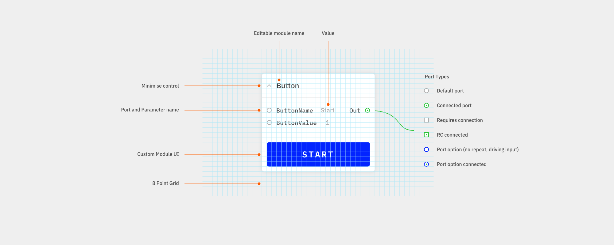
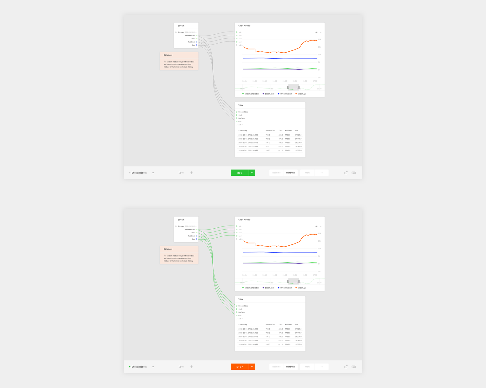
Another issue with the Editor has been that due to the somewhat enthusiastic use of the old brand’s signature orange, it has never been clear when canvases were running and when they were stopped. For a real-time data editor where canvases can be key elements in working apps, it’s essential that a canvas state be obvious at a glance. To achieve this we have stripped colour out of almost everything, leaving users with a distinct green start button that shifts to orange when running and cables which turn green when live. We have also added a status indicator to the bottom left of the screen.
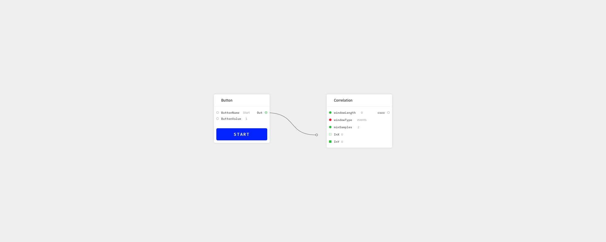
Another frequent problem with node editors is that it’s not often clear which outputs can be connected to which inputs. Any good modern node editor needs to offer smart guidance on this so we have added a simple traffic light system that signals which inputs can be connected to a user’s dragged output type.
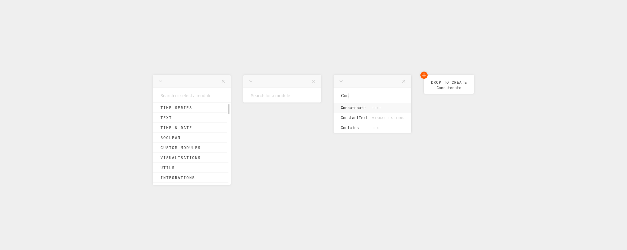
Another goal has been to create a UI that served the needs of both beginners and power users. The redesigned panel for searching and selecting canvas modules is one example of this. When the redesign is rolled out, users will be able to maximise the panel so it is browsable, minimise it to a search box, close it entirely to save space, or put it wherever they like and call it up with a keyboard shortcut.
There has been quite a lot of other work: redesigning special modules, adding a side drawer for module options, help and keyboard shortcuts, reworking the dashboard creator, adding autosave, undo & redo, improving file renaming, cleaning up date pickers and lots of other small things, but these are the main things we’ve been working on for the last several months.
We’re considering that the joint release of the user pages, plus the editor UX revamp, will give us the basic unified Streamr Platform 1.0. Obviously there are other big developments coming down the track (e.g. Community Products and the Network) but with this release we will have a unified real-time data platform, and we hope you will find it useful. Look out for it early next year.


