Let’s get something out of the way. Identity design — or branding if you don’t mind having scorched cattle come to mind — is perhaps the design discipline that can be most, er … full of it. There’s hundreds of Behance posts of fox or eagle icons conforming perfectly to the Golden Ratio. Then there’s those gushing vanity publications by ad gurus about lovemarks, and Brand New threads with commenters eviscerating something based on personal taste. The interesting thing about designing identities is that in many cases, liking or disliking a particular logo, which is just one part of an identity system, often doesn’t really matter that much. More important — do you remember it ? Does it serve its purpose ? Is it functional in application ?

The MTR logo above is a good example. What is it exactly? I’ve no idea,
but it looks like it could be a tweaked version of the character for exit 「出」 which is itself a simplified moving human figure. Others have observed that you can make one by slicing the London Underground logo in two and flipping one half. Whatever the origin story, it is instantly recognisable, memorable and highly visible even in the visual jumble of Hong Kong’s streets. As a key element of the MTR’s identity, it works extremely well.
A logo or mark is just a small part of an organisation’s identity.
Its public behaviour, tone of voice, ethical stance, the usability of its products or services, its responsiveness to customers or users are, together, much more important. Simply plastering things with nice pictures won’t make much difference if these fundamentals aren’t sound. Wiser designers than me have said it more elegantly:
A logo derives meaning from the quality of the thing it symbolises, not the other way around.
— Paul Rand
That said, the visual system for our identity was definitely lacking. So, over the last week, we’ve been rolling out upgrades to it. My aim with this post is to clarify our intentions behind this initial rollout. First, the image style. After I came onboard last year, the first thing that I wanted to improve was the presentation of Streamr’s vision for the future. The ideas were solid, but hard to grasp — what does a decentralised future, where both machines and humans can trade and work with realtime data look like?
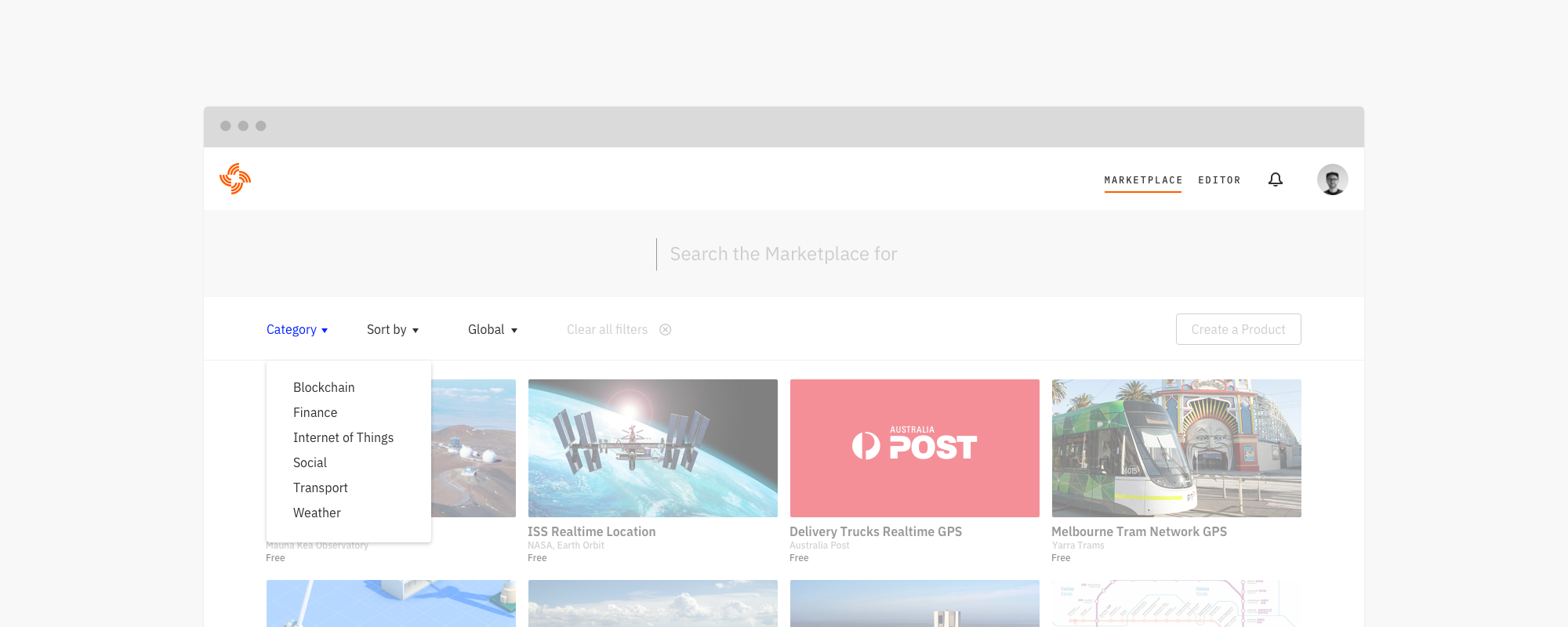
Streamr CEO, Henri Pihkala, and I preferred to avoid the sci-fi tropes that are endemic to crypto, and instead aimed to visualise a semi-realistic, near-future world that works in different ways to our present day. A stylised but detailed 3D world, seen as a kind of “data diorama” was the starting point. To help realise this, we brought the very talented illustrator Stuart Wade on board. Together we worked up a first pass on this, which is visible on the current (as of March 2018) Streamr.com. But while the illustration style was there, the whole package was not quite the right tone. So, next we’re rolling out an upgrade to it with new colours, animation and other elements.

The second part of the identity we’re upgrading is the typography. In our first pass, we were mainly concerned with just telling the Streamr story more clearly. We didn’t have time to redesign the wordmark or consider the typographical elements too deeply. In this second pass, we’re moving away from the licensed Stratos and Realtime families we employed, and shifting to the excellent, and entirely open source Plex family, developed by IBM. It gives us a wide range of weights, full italics, a sans, a serif, and importantly for us, a monospaced font for use both with code examples and in the redesign of our visual data editor. Here the spatial uniformity of the mono will be handy in creating clear and precise patch-based user interfaces. Streamr will be entirely open sourced, but also needs to be typographically excellent — readable, flexible and usable. Plex ticks all those boxes.
We also needed to attend to the mark and wordmark for Streamr. For the wordmark, after trying a range of ideas, we ended up with something very simple — a largely unmodified set of the name in Plex, to keep the entirety of Streamr typography within the same system.
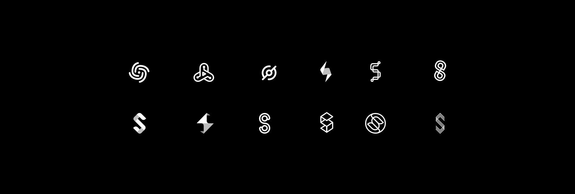
Could we then pair that simplicity to a dynamic mark to capture some of the essence of Streamr’s core? We explored quite a few ideas. The one we hit upon was dynamic, a little organic, suggested an abstracted S, and lent itself to animation well.

Two things helped kill that creation. Firstly, it was a bit too close to one of our competitors’ marks, and perhaps more damningly, our Head of Comms, Shiv Malik, casually remarked that it looked “very centralised”. That comment led us to the final mark. Instead of data points radiating from a single, centralised locus, Streamr’s new mark is derived from the ubiquitous WiFi symbol, representing data sources or nodes that all originate from separate points. As simply as we could, it aims to represent the idea of decentralised data that lies at the heart of Streamr. It also has a negative space shuriken, which can’t hurt 🤓


There’s still a lot more to roll out. We’ve got all our apps, sites, and other materials to work on. I’m sure not all of it will be to everyone’s taste but so far it works well in application, whether dynamic or static, sitting in applications, used as UI animations, in print and on video. So, now it’s time to let it out into the world and see how it flies.
